Bench note
Forms That Fail: Labels, Errors and the Placeholder Problem
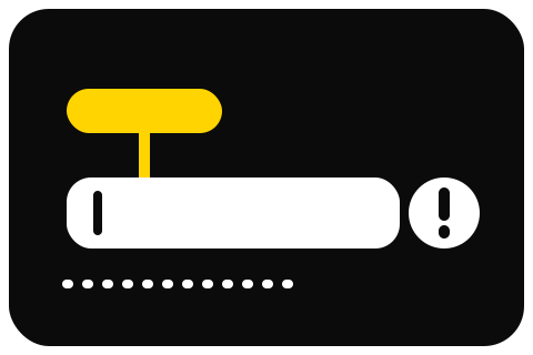
Missing form input labels were detected on 51% of the top million home pages. On a small business site the form is usually the only thing that earns money, which makes this the expensive failure.
Published 2 September 2026Re-measured 19 September 2026
Jump to a section5 sections
Think about what a form is for. On most small business sites it is the only element that exists purely to convert — the contact box, the booking request, the quote enquiry. It is also, reliably, the least tested thing on the page, and that combination is expensive in a way an undescribed photograph is not.
The scale of it: in the WebAIM Million's 2026 analysis, 51% of the top million home pages carried a form input with no label at all, putting it third behind low contrast and missing alternative text.
What a label is, and what it is not
SC 3.3.2 Labels or Instructions is Level A. It asks that labels or instructions be provided when content requires user input. The technical requirement underneath it, which is where things actually break, is that the label must be programmatically associated with the field — not merely sitting next to it.
- A visible label, tied to its field in the markup — not merely sitting near it · SC 3.3.2 Labels or Instructions
- Placeholder text is a hint at best: it disappears the moment somebody types
- An error said in words beside the field, with focus moved to it · SC 3.3.1 Error Identification
Sighted users infer association from proximity. Assistive technology cannot. If the association is not in the markup, a screen reader reaching that field announces "edit text" and nothing else, and the user is filling in a box with no idea what belongs in it.
Three things people mistake for labels:
Placeholder text. The grey text inside the field. It disappears the moment somebody types, which means anyone who loses their place — through interruption, error correction, or simply switching windows — is left looking at a filled-in box with no indication of what it is. It is also, by convention, styled at low contrast, which usually fails SC 1.4.3 on its own. Placeholders are a hint, at best, and a great many designs would be improved by removing them entirely.
Text sitting above the field. Visually this is a label. Programmatically it may be a paragraph with no relationship to anything. Whether it works depends entirely on what your platform generated, which is why this is worth checking rather than assuming.
A field name used as a label. Builders often use the field's internal name as its accessible name if nothing else is set, which is how visitors end up hearing "field_3" and "untitled".
How builders handle this
Squarespace lists pre-labelled form fields among its built-in accessibility features, which is a meaningful default: the association is made for you by the form block rather than left to how you arranged things.
Shopify requires it of themes: the Theme Store requirements state that form inputs must have a unique ID and labels with for attributes matching that ID. That sets a floor on themes admitted to the store, and says nothing about a form an app injects into your page afterwards.
Wix's Accessibility Wizard can detect some form-related problems as part of its page-level scan, which at least surfaces them.
Webflow gives you the elements and expects you to connect them, which is the Webflow answer to almost everything.
Check yours rather than trusting any of this, because form blocks get rebuilt and the version you are using may not be the version documented. There is a test at the end of this page.
Errors are the part everyone forgets
Labels get the attention. Error handling is where forms actually become unusable.
SC 3.3.1 Error Identification, Level A, asks that when an input error is automatically detected, the item in error is identified and the error described to the user in text. Two parts, and most builder forms manage one of them at best.
The common failures:
- The field turns red and nothing else happens. Colour alone carrying the message, which also fails SC 1.4.1 Use of Color. A visitor who cannot distinguish the red has been told nothing.
- The message appears visually but is never announced. The page changed; the screen reader did not mention it. The user is sitting in silence wondering why submitting did nothing.
- The message is unhelpful. "Invalid input" describes the system's opinion rather than the user's problem. "Enter a date as day, month, year — for example 14 March 2026" describes what to do.
- Focus stays at the submit button at the bottom of a long form, with the error twelve fields up and out of view.
- The form clears itself. Every field emptied because one was wrong. This is not a failure of a specific criterion so much as a failure of basic decency, and it happens constantly.
Six things worth doing
- Use visible labels above the fields, always. Not floating labels that animate into the border, not placeholder-only. Visible, persistent text.
- Delete the placeholder unless it adds something the label cannot, such as an example format. Then write it as an example and keep the label too.
- Mark required fields in text, not only with an asterisk in a colour. If you use an asterisk, say what it means in words somewhere before the form.
- Write error messages that describe the fix. What was wrong, and what to do instead.
- Move focus to the first error on a failed submit, and never clear the fields.
- Say what happens on success. A confirmation message that appears with no announcement leaves people repeatedly resubmitting because nothing told them it worked.
Test your own form in five minutes
Do all of this on your real, published form rather than in the editor.
Keyboard only. Tab into the form, fill in every field, submit it. Can you reach everything? Does every field show clearly that it has focus? Can you activate the submit control with Enter?
Submit it empty. What happens? Is there a message? Is it in text rather than only a colour? Can you tell which field it refers to?
Submit it wrong. Put nonsense in the email field. Does the message explain the format expected?
Zoom to 200%. Do the labels still sit with their fields, or has the layout collapsed into something ambiguous?
Look at the markup. Right-click a field, inspect it, and check for a label element with a for attribute matching that input's id, or an aria-label carrying the same information. This is the check that tells you whether the association is real or only visual.
Any platform can pass this and any platform can fail it, which is the theme of the assessment of ADA-compliant website builders: the platform sets your starting position and your form decides the outcome. And as everywhere on this site, none of this is legal advice.
Questions from the bench
Is placeholder text ever acceptable?
My builder generates the form. Is it fine?
How do I make an error message announce itself?
Does a CAPTCHA cause accessibility problems?
Where this is filed
Every note here sits underneath one assessment: ADA-compliant website builders, which is where the platforms are read side by side. Nothing on this site is legal advice, and no builder on that page is sold as a route to compliance.
The recheck notice
When a platform quietly changes what it gives you
Builders move accessibility features without a changelog: a theme restyles its focus ring, a wizard learns a check, a field migrates to another panel. The recheck list is meant to carry one short note whenever a page here has to be corrected. It is not switched on yet, so this form keeps nothing — until it is, the re-measured date at the foot of each page is the record.